I designed a mobile application that improves customer interactions in areas such as viewing store menus, ordering for pick up and delivery, setting up a meal plan, accessing the rewards programs, and much more. The result -- a more accessible and convenient mobile experience that facilitates customer engagement and retention. Consequently, business growth and brand presence.
UX Research, Strategy, UI/UX Design
Solo
July - Sep. 2022 (12 weeks)
Power Plate Meals conceptual app prototype

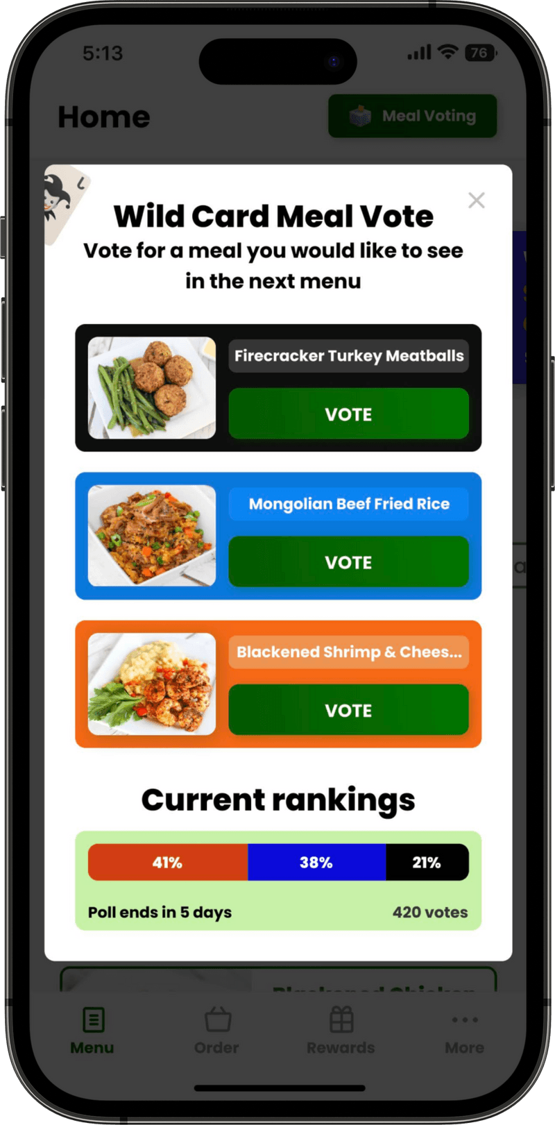
Allows customers to vote for a meal that they would like to see on the next menu.
Customers are more likely to purchase a product they have already voted for.
Over time, voting data can help uncover meal refinement opportunities.
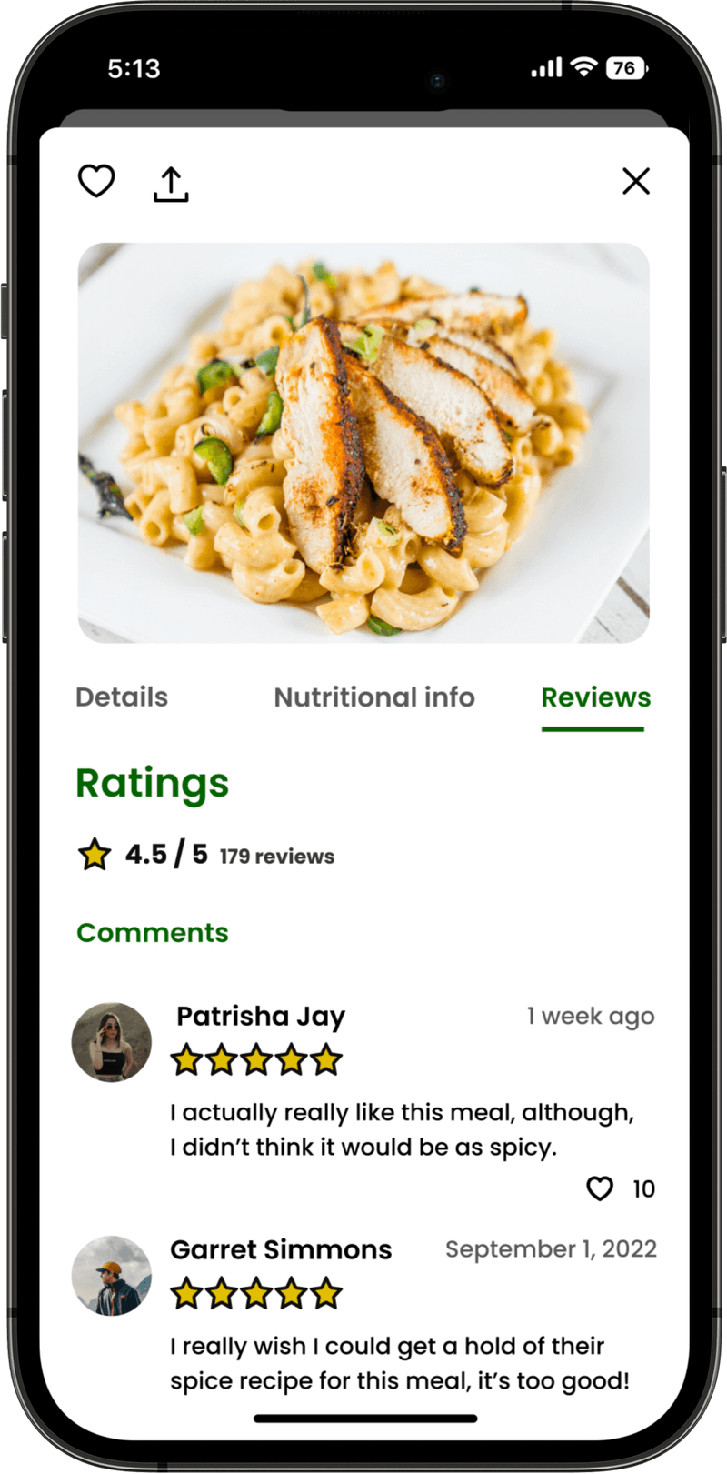
Allows customers to see what others think about meals, interact with other customers, and provide their own feedback.
These insights can aid customers in deciding which meals to purchase and assist Power Plate Meals in improving their products.
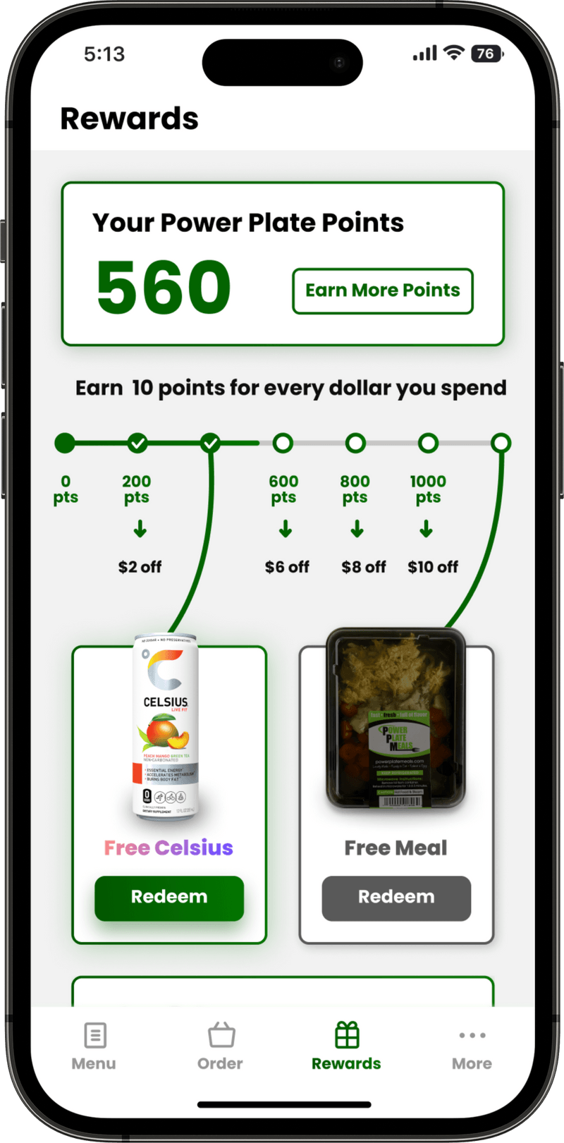
This page provides customers with rewards details and allows them to redeem different products using their accumulated points.
A section near the bottom of the page allows users to earn points for engaging with Power Plate Meals social media platforms. Fostering brand visibility as result.
Power Plate Meals is a nutrition-based meal preparation company that primarily sells low calorie-high protein prepackaged meals (a mouthful, I know). Power Plate Meals also sells pizza, beverages, and healthier alternatives to common snacks. Their goal is to make healthy eating accessible to all.

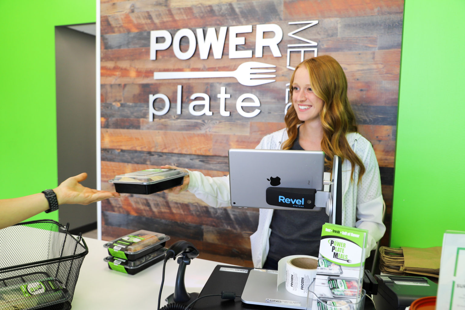
• Power Plate Meals does not have a dedicated mobile platform that allows customers to access ALL of its core services.
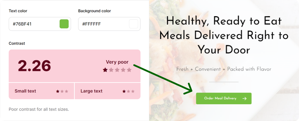
• The current mobile version of the Power Plate Meals website does not consider customer accessibility and is often difficult to navigate.
• In this digital age, it has become increasingly evident that in order for a business to facilitate growth, it must be able to EFFICIENTLY provide its services on as many platforms as possible.
Americans spend 88% of the time on their phones using apps and only 12% browsing the rest of the internet (insiderintelligence.com)

On average, mobile apps are 1.5 times faster than websites, allowing for an accelerated data retrieval rate that offers a more enjoyable browsing experience (eiosys.com)

The ability to instantly send out push notifications allows businesses to keep customers up to date about new products and promotions resulting in increased customer engagement and potential revenue (onesignal.com)


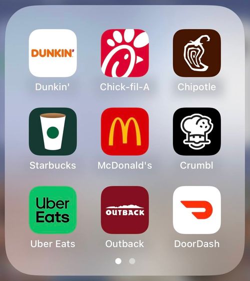
After identifying improvement opportunities, my first plan of action was to evaluate the functions, features, and UI of the most popular food apps already on the market through repetitive/comparative benchmarking.
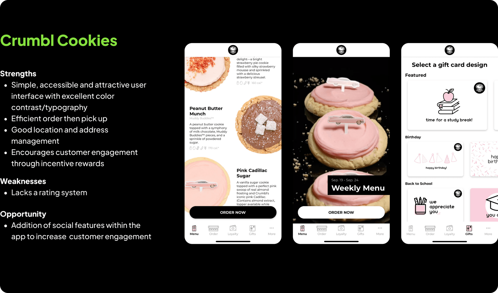
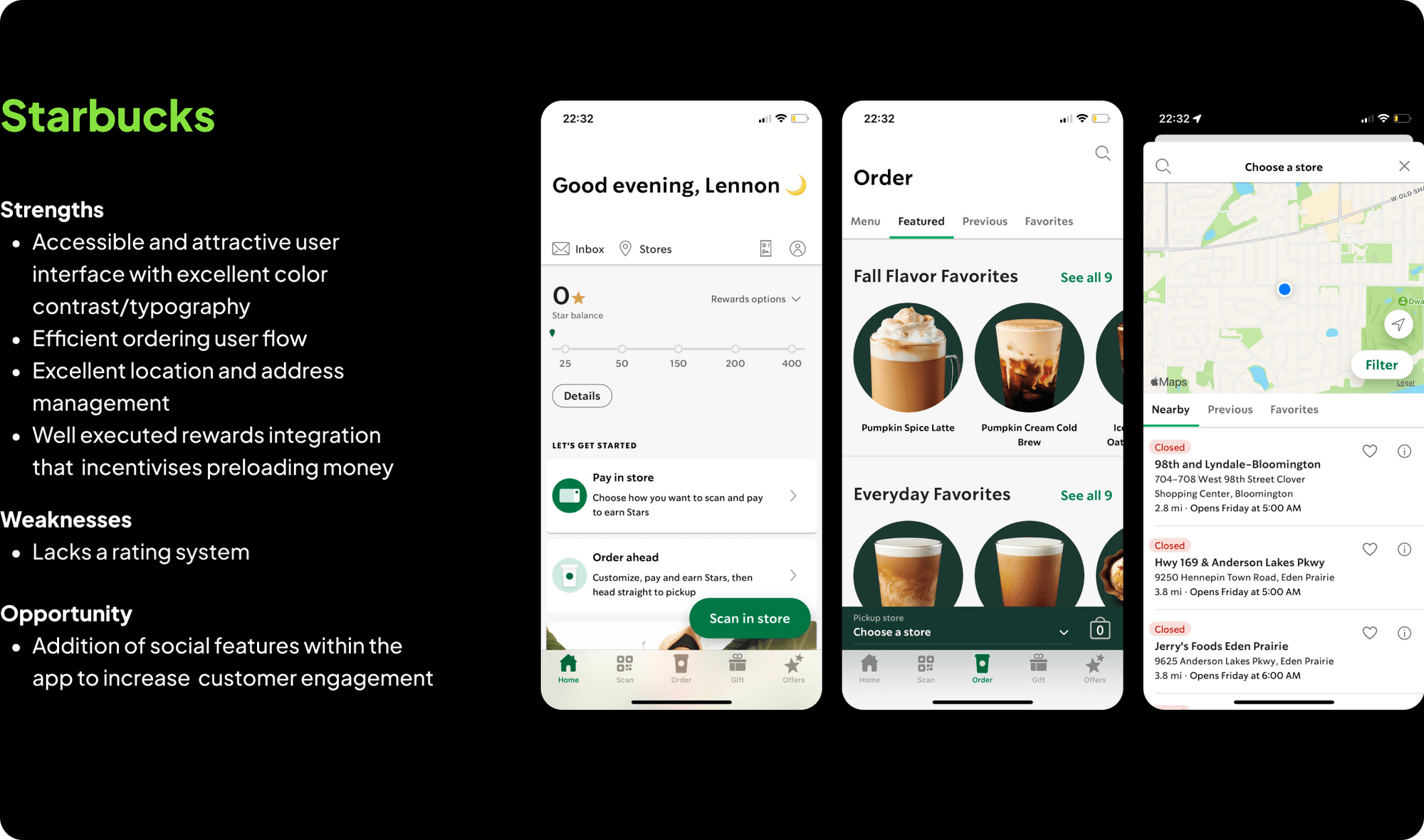

Some things I wanted to learn:
1. 🤷 Who shops at Power Plate Meals
2. 🤔Why customers choose to shop at Power Plate Meals
3. 🤕What pain points customers have experienced when using the Power Plate Meals website
4. 📑How can Power Plate Meals improve mobile device customer experience
5. 📅When customers decide to shop at Power Plate Meals
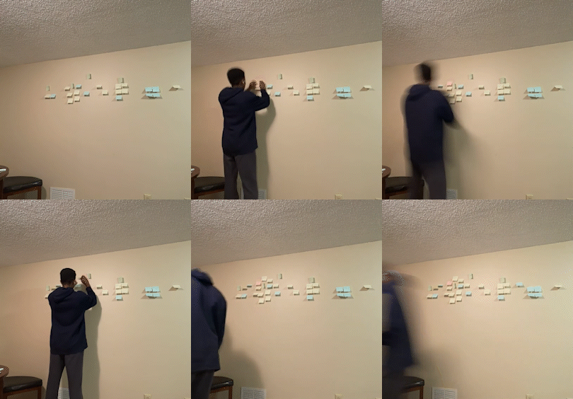
I created an affinity map based on interview insights and secondary research. I compiled the data into four main groups:
1. Low development effort, low impact
2. Low development effort , high impact
3. High development effort, low impact
4. High development effort, high impact
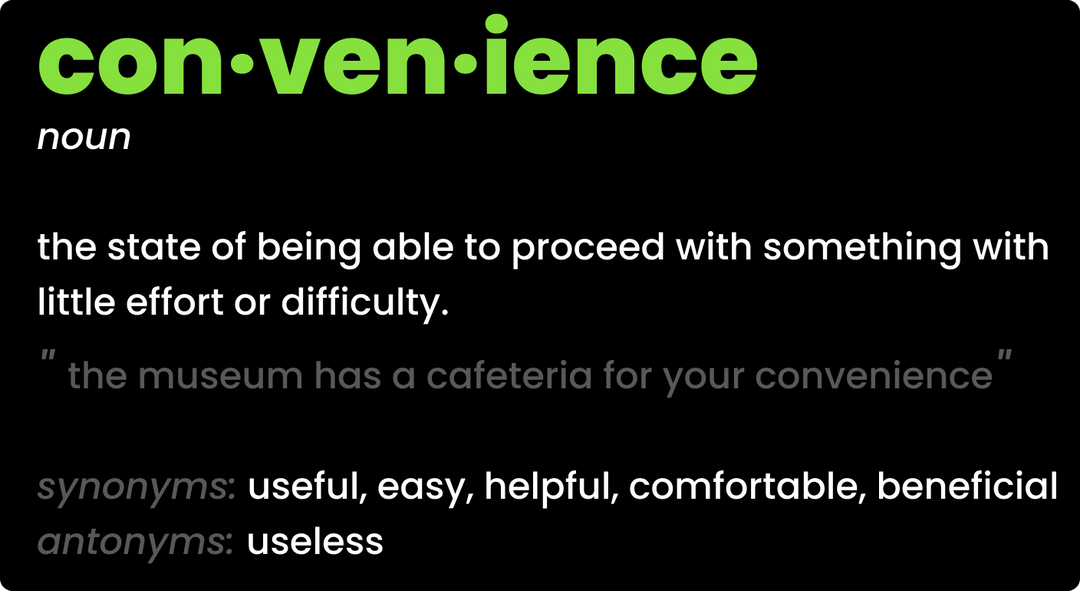
• 100 percent of customers stated that health and convenience were their primary reasons for shopping at Power Plate Meals.
• There was uncertainty about whether orders had actually been placed due to vague website feedback.
• Customers that had used the website were not aware of all the services that it offered.
• There was no way of knowing about the meal inventory status without calling a store.
The main features that customers would like to see on the app are the ability to:
1. See the newest menu
2. Order for pickup and delivery
3. View rewards and deals
4. Set up a meal plan
5. See meal reviews

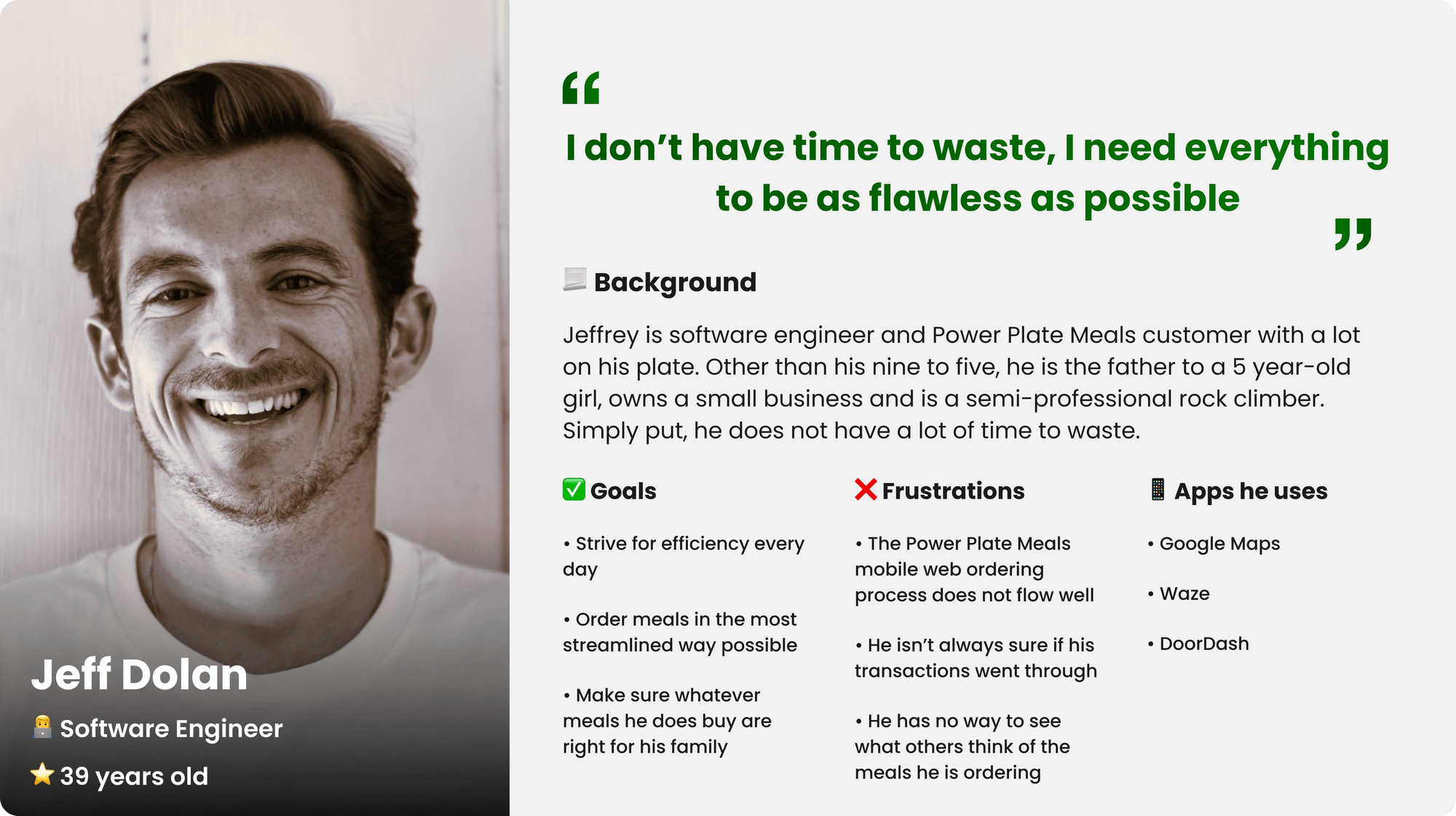
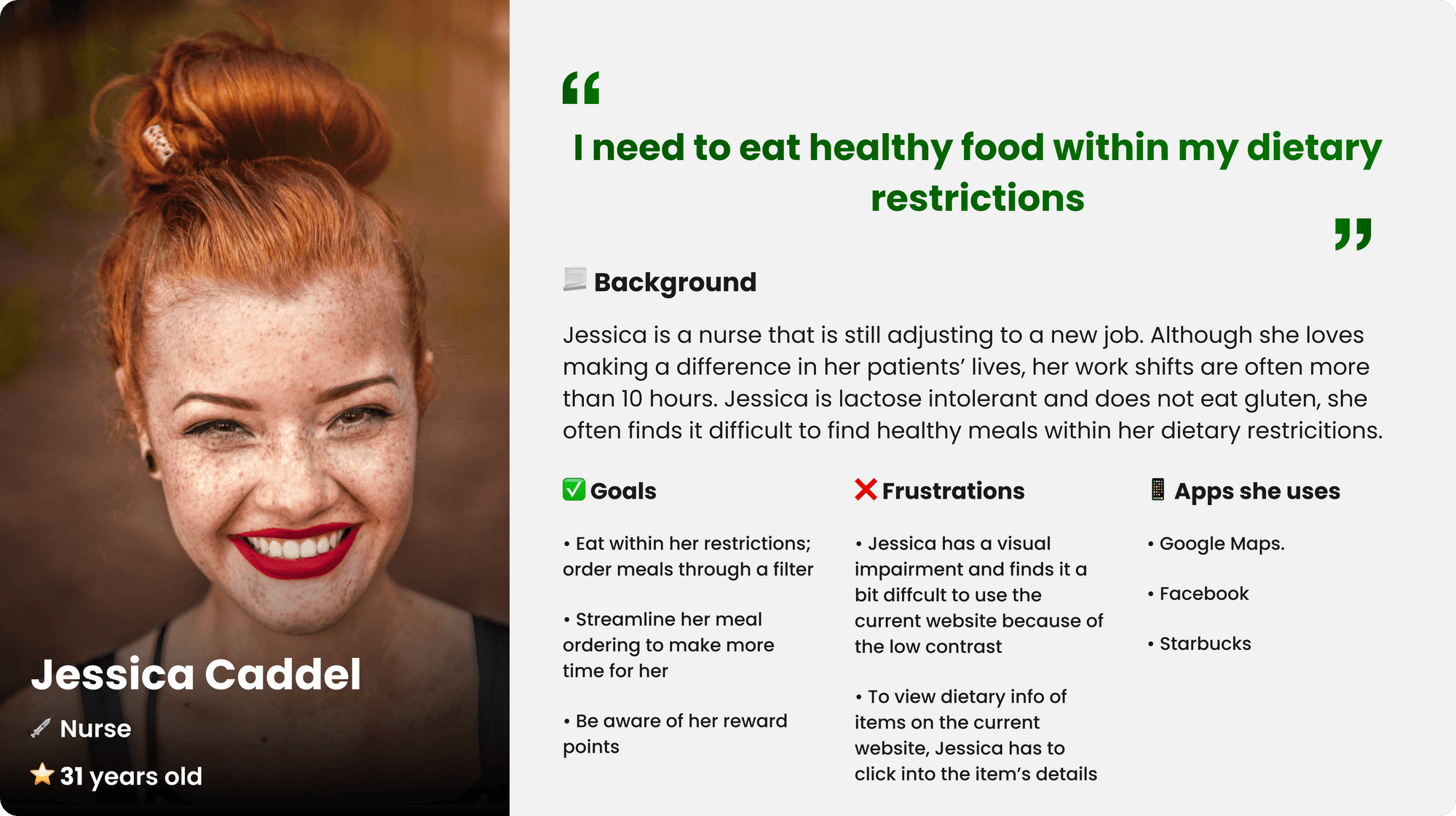
To better empathize with the customers I interviewed, I created personas that incorporate their characteristics and pain points.
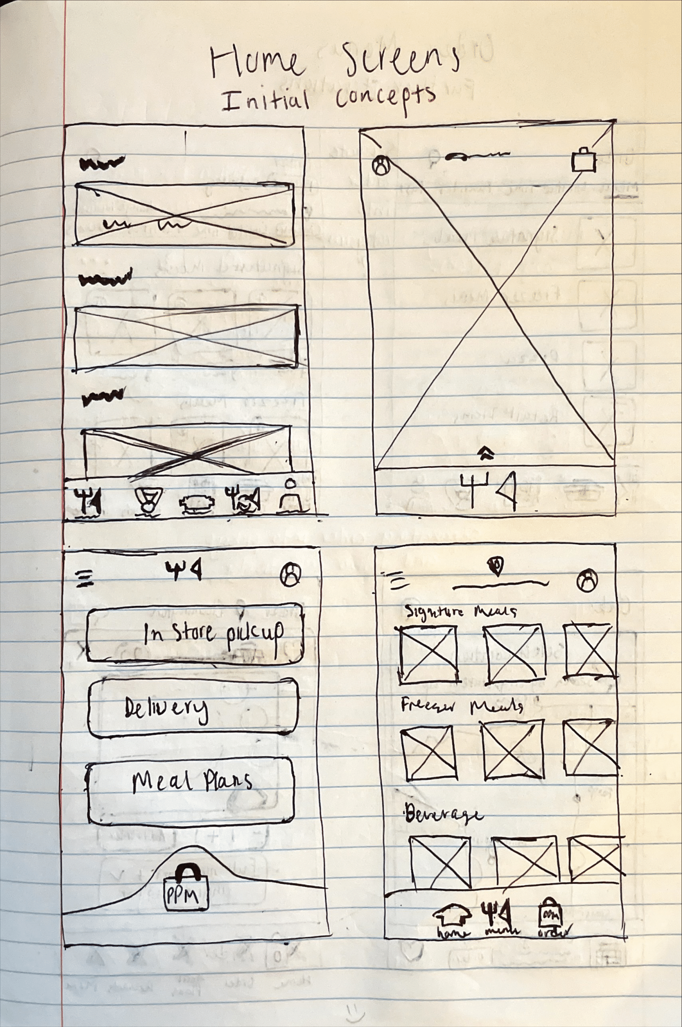
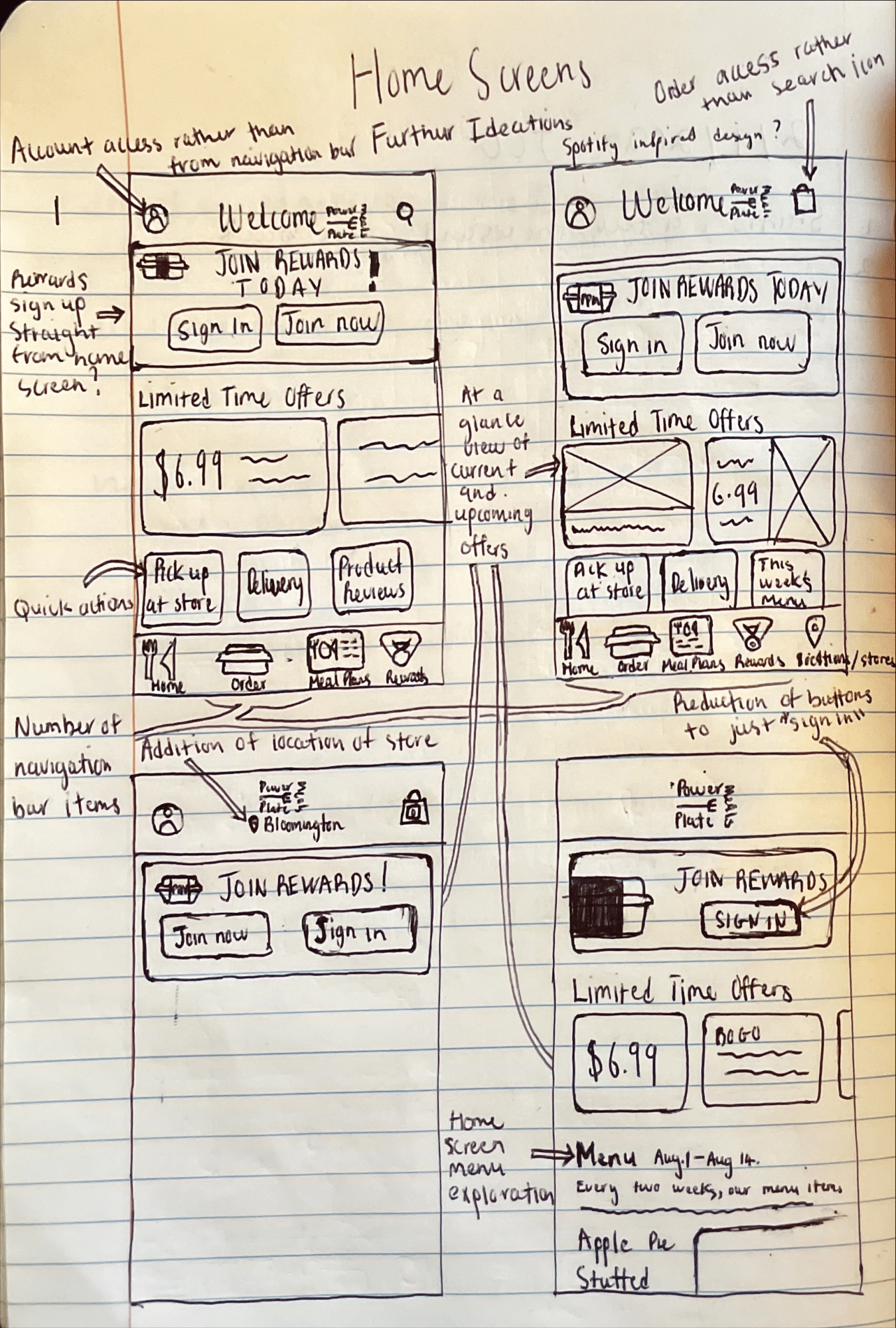
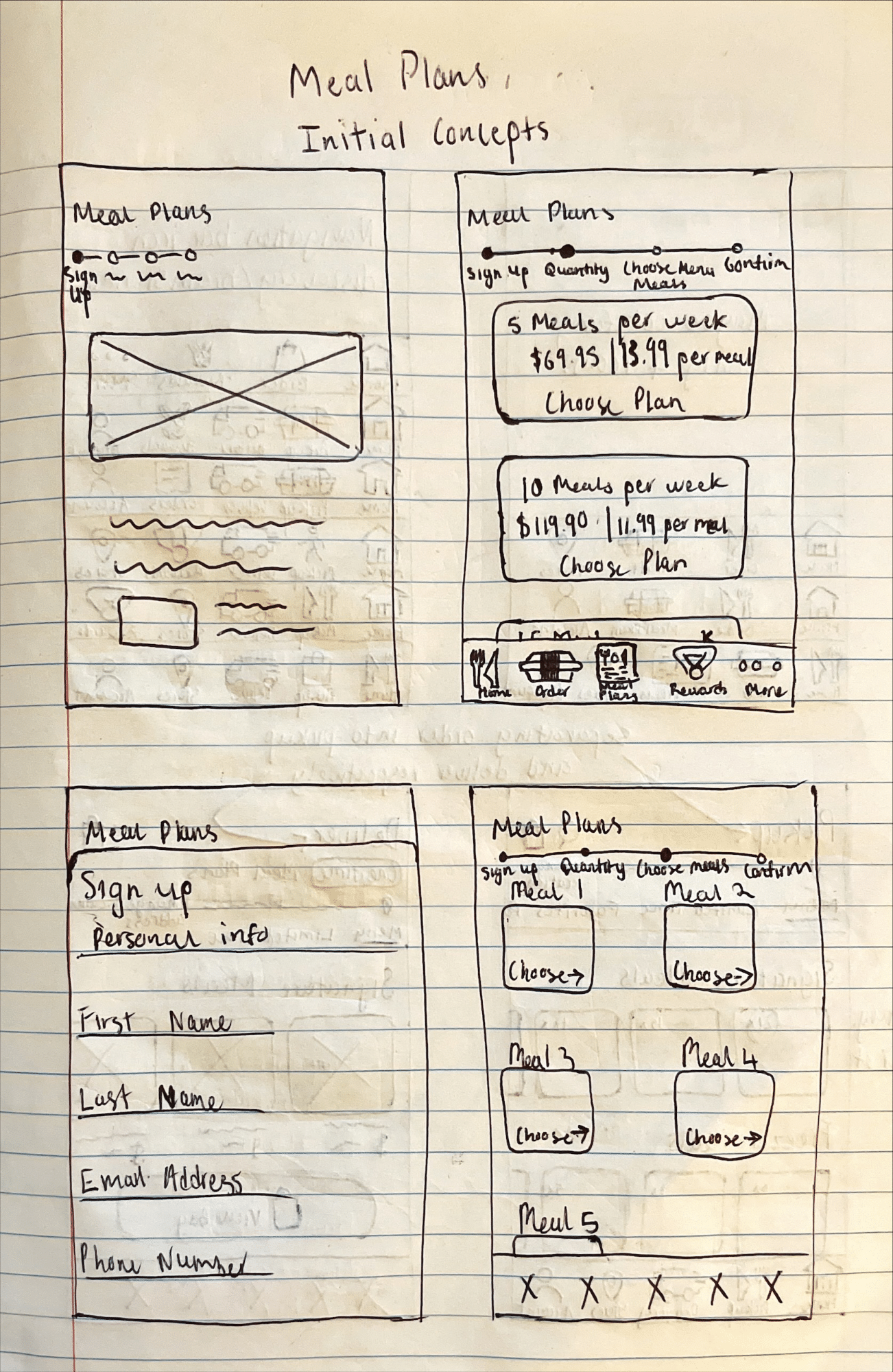
After gathering the research data, I began the design phase by sketching concepts and paper wireframing.
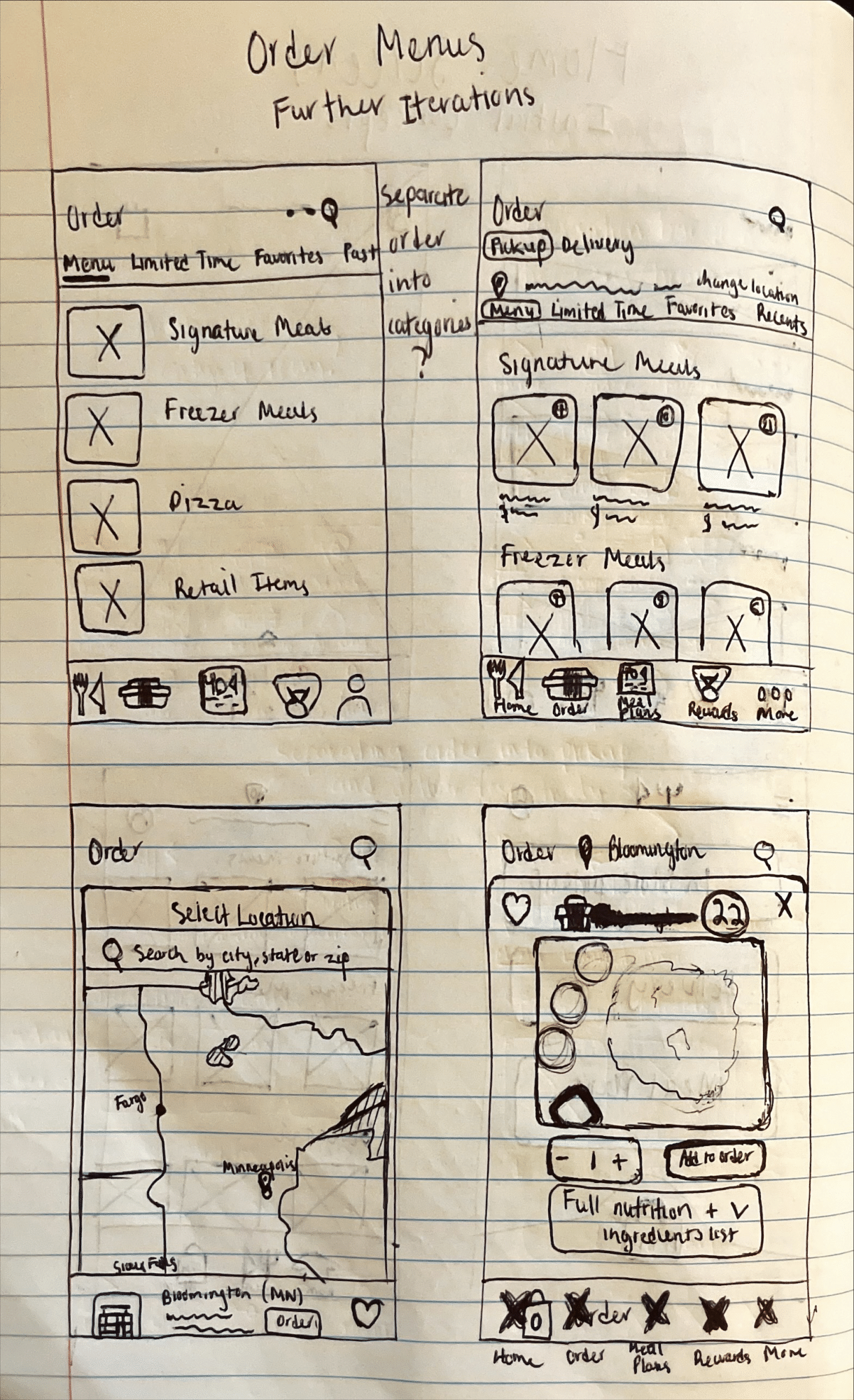
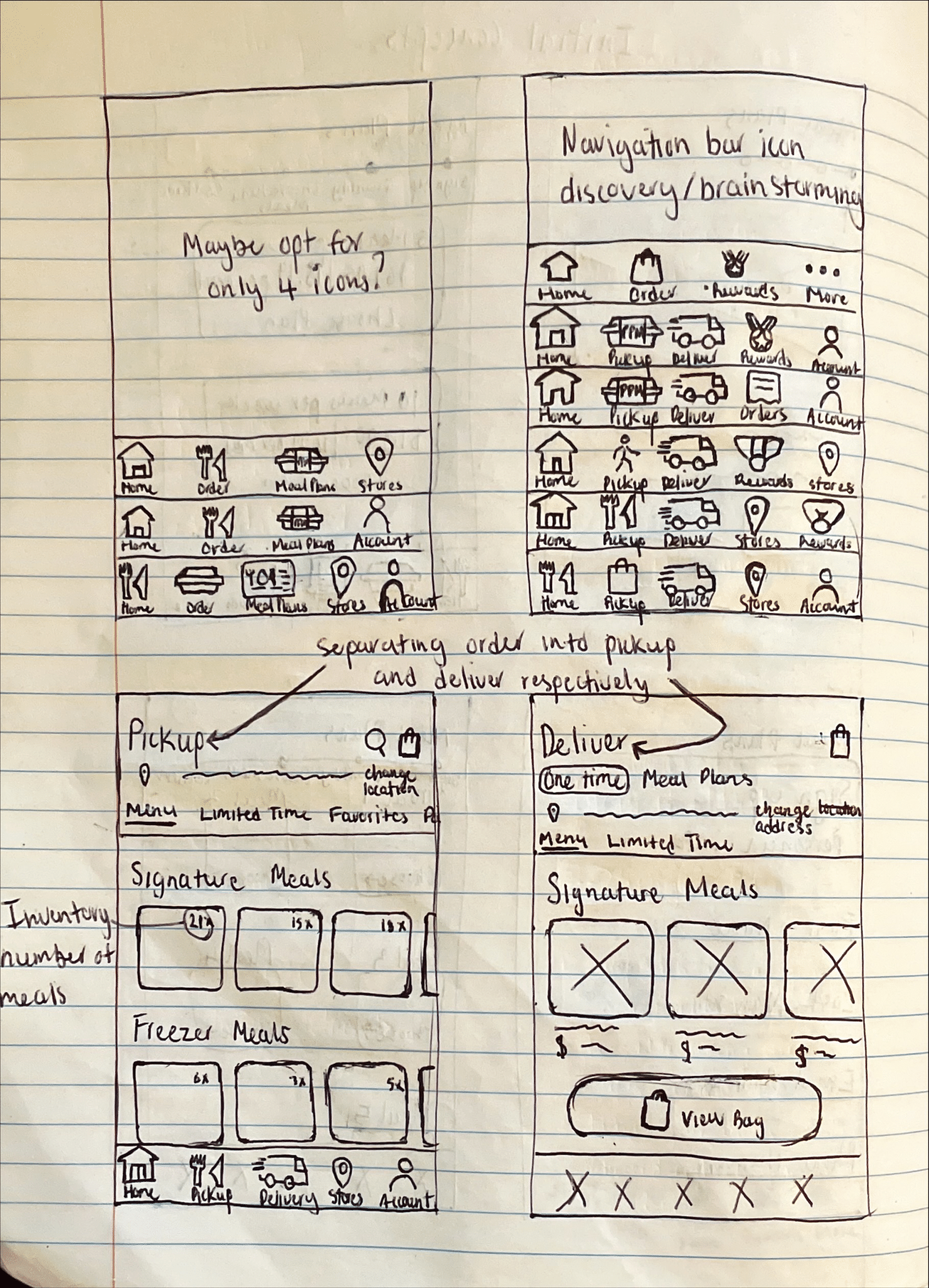
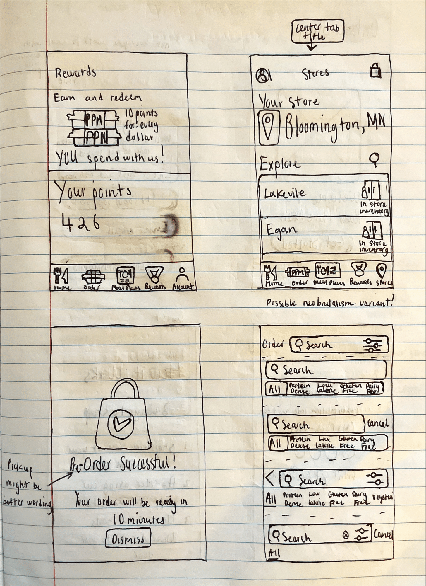
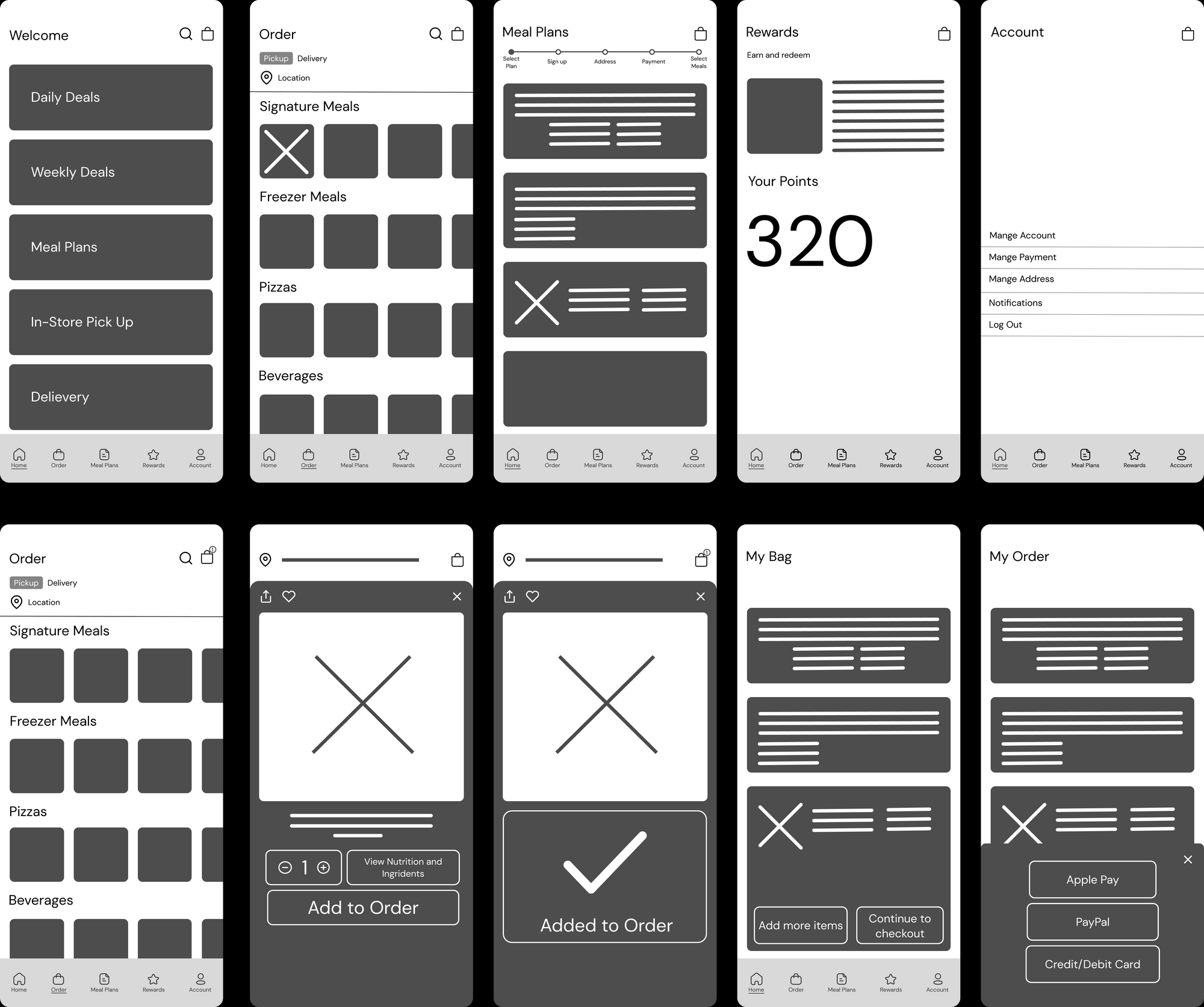
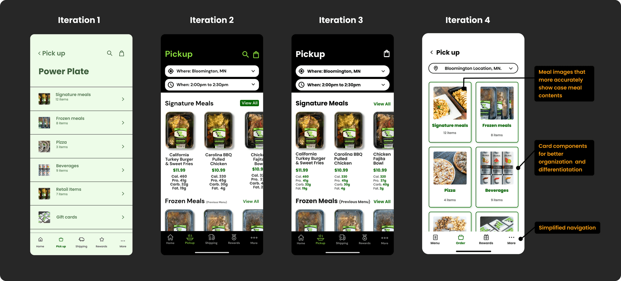
I conducted a usability test with 5 participants to validate the designs. I showed them a Figma prototype and monitored interactions as they navigated core flows. The main improvement opportunities I gathered were to:
1. Add an interaction transition to the order screen when the menu is tapped.
2. Prompt users to onboard AFTER they've been able to look at the menu.
3. Decrease the number of screens required to complete transactions.
4. Be mindful about the over-use of color for the food category tags
5. Increase meal card image sizes.

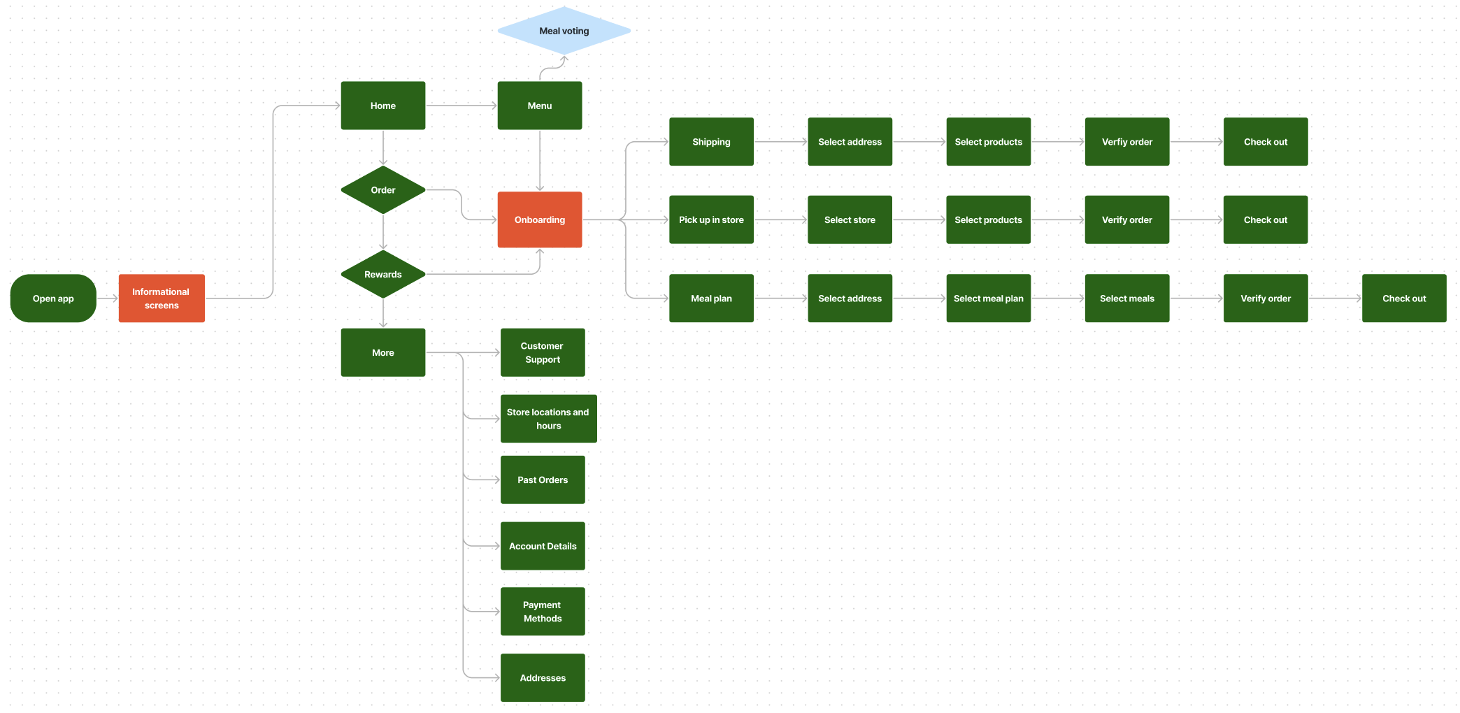
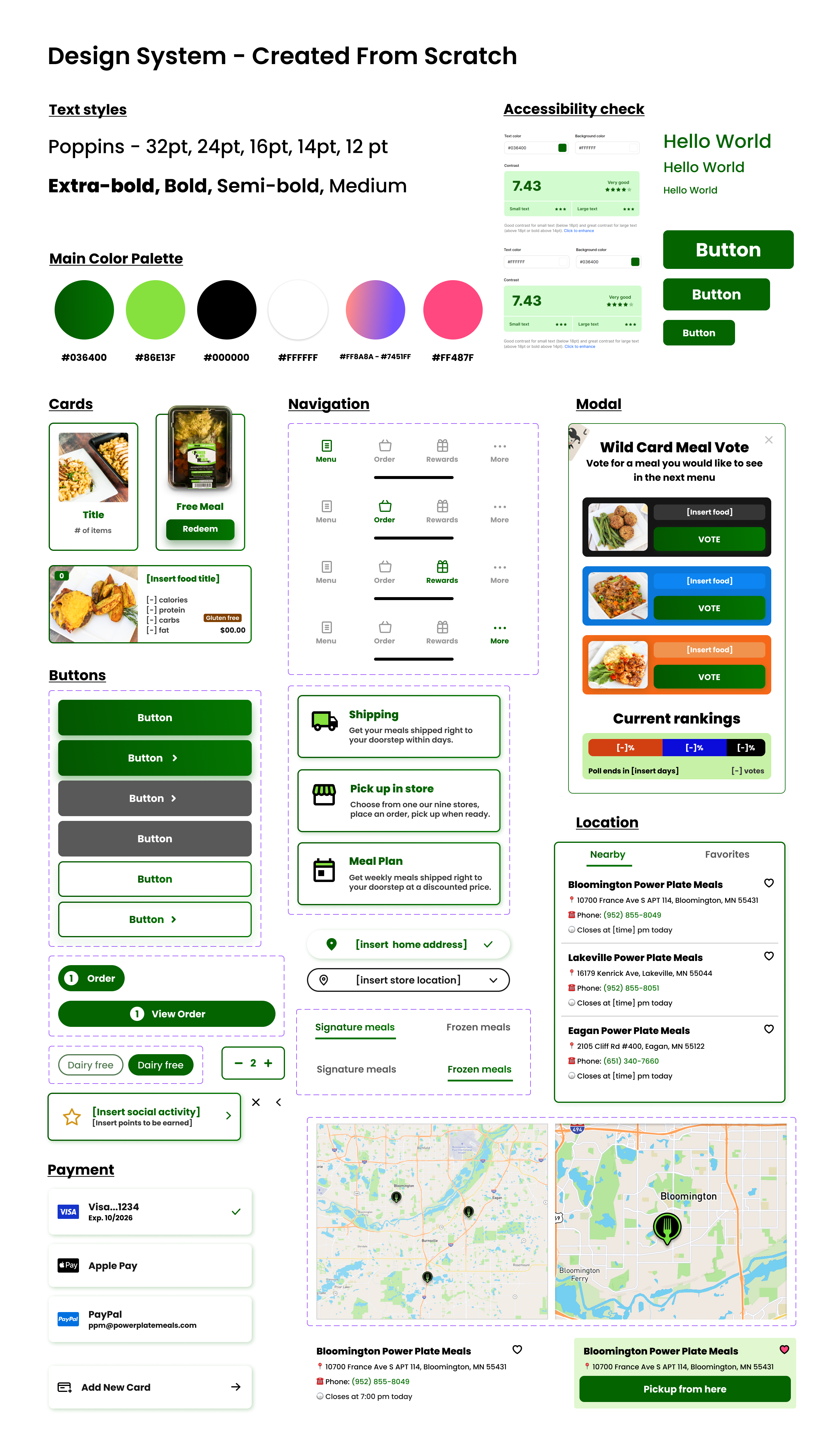

- Power Plate Meals leadership team
- A Doordash API integration could be used to fulfill local delivery orders.
- Jessica and Jeff would mutually benefit from the review sections and meal filtering.
- The app would: create internal job opportunities(leadership, fulfillment, kitchen expansion, retail store expansion) and eliminate the need for customers to call stores or physically visit them in order to determine store inventory.
- The most important KPI is to KEEP PEOPLE INTERESTED, which this app would succeed in doing.
This project was challenging, fun, and taught me a lot of things, some of which include:
1. Balancing business goals and user needs is what makes a great product .
2. Using impact to prioritize; it's all too easy to fall into the trap of implementing every feature discovered through research.
3. SILENCE IS OK during user interviews, it's were most discoveries are made.
4. You did not fail; you simply discovered 10 ways that did not work - now pivot.